Monday, 20 April 2015

My Magazine


My Final Magazine in full chronological order. 

when creating my magazine i decided not to just make a cover, contents and a double page spread but try and make a few more features in my magazine. 

So i made a Front cover, Contents page, An album of the month, A page of tracks of the month, an advert, A double page spread linking to the front cover & a double page spread of photos like a poster page. 


when I was designing my front cover I decided to make it similar to many main magazines having an obvious headline, that stand out from the background also having a subline with the main headline in this case I have surrounded 'THE SHEIKS' with 'The best live band around at the moment' to give the reader some detail but also wanting more when looking at the front cover.


above is the contents page on the left, complete with an album review on the right. I felt like if I was creating a magazine, with a front cover, a contents page and a double page spread I wanted to give the magazine more context and character, even if it does count towards anything I feel like creating extra pages would make it look more aesthetically pleasing to the eye.


above is on the left is would be 'songs of the week/month' in any other magazines. I felt to add this would make my magazine look better. on the right is a simple advert for an album sale


above is my double page spread/interview. I decided to make this a plain and simple looking structured spread. on the left page is what would be considered a short biography about the story of the band and then an interview with each members answer for the question. the colour scheme for the whole magazine is represented  well on this page.


Sunday, 18 January 2015

Evaluation 5

How did you attract/address your audience?

- i think the main way I've managed to attract my target audience is through the mature language used in it, the colour schemes, the photo's and even the content in the magazine. The language I've used would not be used in a pop magazine, it is purely used due to the fact i know that 10 year olds would not read my magazine. the colour scheme i would consider as mature because of the black and white photo's, writing & backgrounds. the photos along with the content are ones of more grown up music, mature band ands just the whole look of the magazine. 

Evaluation 6

What have you learnt about technologies in the process of creating this product?


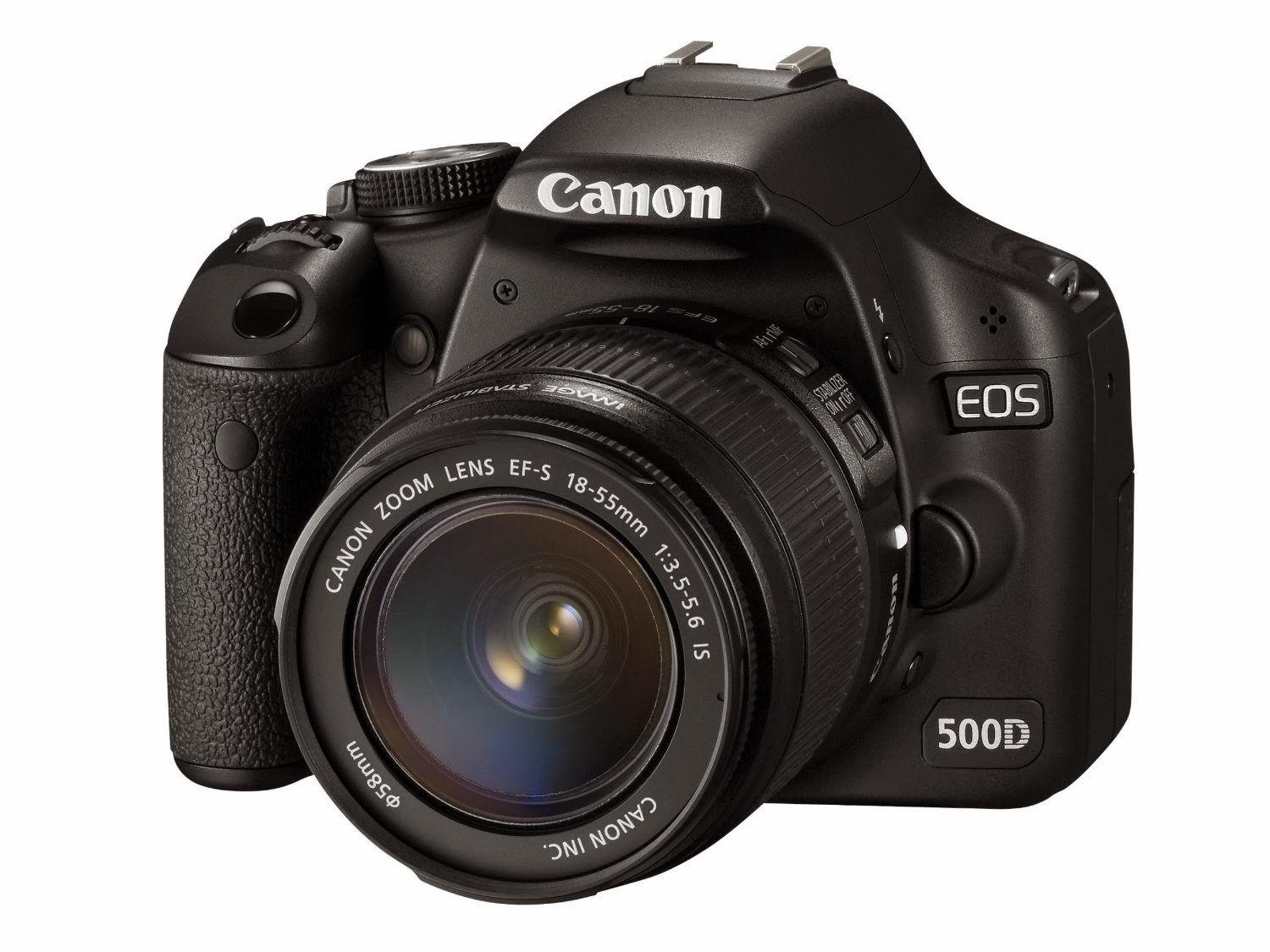
-      - when creating this magazine, i used multiple different software’s to create the edited photos, logo and the final magazine, and used a professional camera for the first time in taking the photo's I needed. Editing the photo i used Serif Photoplus, I normally use Adobe Photoshop but i decided to use serif to create my photo. I took the photo on a professional camera borrowed from school, in order to use the photo on my front cover. When i had already got my photos i used serif photoplus to create an edit on my photo, i wanted the photo to have a certain warmth to it and i used a filter that when zoomed closer to the photo is visible, that it has a red and blue tinge to somewhat make it look 3D even though it was not 3D. The changed the contrast and colours to a warmer, added a filter and a vignette around the outside to darken the corners of the photo slightly. when i had finally decided that my photo was edited enough i then saved the photo as a jpeg and moved it across into Microsoft Publisher. Once i had designed my logo on a separate publisher document, and moved it into the document with the jpeg edited image of my 'bands' photo. 


Evaluation 4

Target audience, how you found out what you believe to be your target audience?

- When deciding and finding out who my target audience would be for my magazine i had to look at many factors, magazines that are already out that are similar to my own, and doing my research to find out what their target audience would be. My magazine's genre is indie rock/alternative, therefore i had to look at other magazines that are based around indie rock and alternative music, so i decided to research 'NME' to gather info about my magazines target audience. the target audience for NME is mostly males aged 16-24 therefore id say the target market for my magazine is young adults from 16-25 due to the colour schemes, photos and mature language withheld in the magazine. 

Evaluation 2

How does your media product represent a  particular social group?

- i feel like with my magazine having a name abbreviated for 'New Alternative Music' (NAM) was the best way for me to make it obvious as to which 'social' group my magazine was aimed to portray/represent. Indie Music/Alternative rock music, is the music genre i aimed my magazine towards, based solely on NME which features its magazine around indie rock with a few spin offs from time to time to allow diversity in the issues. I think the main reason it would represent a social group is due to what music features in it. mentions of Arctic Monkeys and even my band 'the sheiks' as to which are described in the magazine as a 'indie rock band' and mentioning things here and their that are to do with the alternative scene, festivals such as Glastonbury a festival that is heavily endorsed by big rock and indie bands. even the colour scheme I would say has a certain bland original feel to it. maybe this is due to the copious amount of greyscale photos I have put in my magazine. or the simple black and white colour scheme on the masthead. 

Evaluation 1

In what ways does your media product use, develop or challenge forms of conventions of real media product?

- I based my magazine around the well known and loved NME (new musical express) the forms that they use for their bold mast head, their logo which is clear and the usual content expected from NME, on new up and coming bands, and some of the biggest bands/artists from around the world have featured in it included the likes of Elvis Presley, Arctic Monkeys, Foals & even Kanye West. 

i think my magazine uses conventions in the style of the mag. It uses the same style 3 letter abbreviated for a longer phrase.. (NME = New Musical Express. NAM = New Alternative Music) for example. 

here are two magazine overs, the one on the right is my rough copy and the one of the left is one published by NME of Alex Turner. On NME they have many plugs on mine i have one main plug but a large main cover line to show the reader what and who is my magazine about. 


Evaluation 7

Looking back at your preliminary task, what do you feel you have learnt in the progression from it to the full product?

- looking back on my preliminary task (which was to design a school magazine) i think that when i have designed my magazine i had a pretty good idea as to what i wanted it to be look like, something plain, yet catchy.. having a strong masthead which was bold, for the actual magazine i decided on a name pretty early into design, and what i wanted it to mean, so NAM (New Alternative Music) was what i decided on. i knew i had to have plugs on the covers of my mag. i feel the way i designed my magazine is of a high standard and has a professional look which is what i aimed for with the magazine. my preliminary task (1st below) was a rough cover which i was still getting used to knowing what different features to use to create a magazine. once i had designed a masthead logo (bottom) i started to play around with the software and decided to create two rough magazine covers to give myself a feeling oh what i want my magazine to look like. (two in middle) i think it is visible to see the difference between the first design idea and where i have had longer and took my time to create two magazine covers to a high standard and to make them look as professional as possible. 


Evaluation 3

What media institution might distribute your magazine and why?

- when thinking about how to distribute my magazine, I have to take into consideration the fact that their is three different ways of publicising them. Independent Publishing, Self Publishing & Major Publishing.  

I researched who publishes NME magazine, and as due to the fact I believe that if I was to publish my magazine I would send it off and like it to be published & distributed by Time Inc. UK formerly known as IPC media. Time Inc. sells over 350million copies of magazines worldwide every year, the company have a huge portfolio and I believe that if my magazine was to become a real issue every month id like Time Inc. to publish it, any company with the same networks and knowledge, also produces NME and many other well known magazines such as LIFE magazine and WorldSoccer which I read too, But for my magazine to gain recognition and the respect as to what I would want it to I would want it published and distrusted by TimeInc.


When deciding which publishers would be the best, Bauer media group came into mind because they produce good magazines such as Q & Kerrang! but both of which aren't the same genre as my magazine therefore I would not like it to be published amongst a Major Pop music mag and a rock/heavy rock mag. I did seriously consider it though, due to the fact the Bauer media group would have huge connections and a big following and maybe they have room for a successful Indie music magazine amongst the other two major music magazines.


Friday, 16 January 2015

Magazine photos


When deciding what photo's and what to wear in them, my idea was pretty simple.. 'try and look like an indie rock band' & wear things that were abhorrent yet strangely worked... like one of my friends in my photos wore a tartan coloured t shirt (blue and red) with a fur coat... thinking about it, it shouldn't work, yet in context for my magazine it did. this photo (below) in the magazine was not in colour, i decided to use a greyscale filter in order to fit three separate photos together for my double page spread. all these photos are the ones I've used. 


this photo was used as my main cover photo, the left one is the unedited version, the one on the right one was used as my main cover photo and the middle photo is my rough final magazine cover. the composition of this photo is one that many of bands and major magazines use, with the main singer.. in this case, me at the front looking blankly into the camera with the rest of the band in the back ground positioned so that they are still noticeable. Many magazines use this technique when taking photos as shown below.


these photo's are original photos i took and are within the magazine itself. 


Friday, 21 November 2014

Rough Magazine Ideas

Rough Magazine Ideas.
 
 
For my magazine name I had to stick to one genre, indie rock/alternative. obviously it gives me room to branch out due to an expanding genre of alternative music, anything from the heavier side of indie rock to the feel good summery side of the genre. and everything in-between. as I said in the last post, NAM is the name of my music mag. All of the main images were sourced of Google/Bing. but the text I had to put in myself. both magazines are just rough covers and are missing vital things, such as date's and barcodes. however these magazines are just rough quick little throw together to give me an image of the ideal magazine id like to create at the end, once I have sourced my own photos I can start working on my mag. to create these magazine front covers I used Microsoft Publisher, because it quick, easy and gives a professional look to my magazine without having to know the ins and outs of every dimension and having to create different layers, and this is the simplest way for me to create a sharp magazine and for me to create my ideal front cover.  with my magazine I have aimed it towards a sort of NME look with bold contrasting colours working together to create an eye catching style to the cover.


Indie Magazine Name ideas.

Magazine Name Ideas.


Coming up with a name for my magazine had to be the hardest decision, I had a rough idea that my magazine was to be based on the rolling stone of magazines NME (New Musical Express), so I decided to go for an abbreviated name also. NAM (New Alternative Music) was the name I settled for, with a simplistic logo. Usually there is no background square, I just needed a colour to show that around the outside of the text is an outline of white to give a contrast to the black. To give myself an idea of how id like my magazine to look I did two rough cover's of artists that Id expect to categorise within my genre.

Friday, 17 October 2014

ideology in Rock

Rock
 
 
Most people assume rock as a dark and rebellious genre of music, and they'd be right to do so. but the majority of rock and heavier music is purely for the music, people don't listen to bands for what they look like, they listen to the music. But recently rock band have had to change their image, because nowadays it is what they look like too, which is a shame because they spend more time on an image than their music. Rock is considered dark and grungy, every now and then a new band comes along and steals the limelight for a brief minute and they have a perfect balance of swagger, style and good music. a band like Royal Blood, new to 2014. Enough swagger in interviews and style to catch an eye, and great dynamic music, also they bring something new being a two piece rock band.

if you talking a long time back into the rock bands it wasn't necessarily about style but just image and what image the produced for the listeners and also the music was good, so bands such as Metallica and Black Sabbath. although style does play a part I think you can tell the type of music they make by just hearing a band name or looking at what they're wearing or how they say things, you can almost decipher what music genre they make.

the music magazines covering the rock genre are often dark colours and have text that is often distorted.


Monday, 13 October 2014

mood board

for my magazine I had to create a mood board on things that would concern my magazine, because I want my magazine to be based purely on music, no stereotypes, just the music so making a mood board full of bands that I love the music of.

the 4 f's of magazine design.

The 4 F's of magazine design.

 
1. Format.


2. Function.


3. Frame.


4. Formula.

why i like Indie Rock magazines.

INDIE ROCK MAGAZINES

My style of magazine is going to be an indie rock magazine, the reason I've chose this is because I am a massive fan of the genre and multiple bands involved, everything from Arctic Monkeys to Foals, and from Phoenix to The Smiths. I love all kinds of indie Rock, alternative rock and anything with a good solid rhythm. One of the fore frontiers in the indie rock scene of magazines is NME, (New Musical Express) I love this magazine because its not about image with them, its purely about the music, And new music too. it keeps the reader up to date with news and good songs that all indie rock lovers will like. I think the main thing that keeps people coming back for more is the diversity of the music and how good the magazines are sometimes at predicting the next big bands, or even themselves making a band big by giving them lots of publicity. Arctic Monkeys were made huge by the NME by giving them multiple covers and overhyping them at the time, but for me it was a great move by the magazine as now they are one of the biggest bands in the world, NME have that recognition for giving them lots of publicity and making them the chart topping band that they are.               

NME made this cover back in 2005/2006 just after the release of the first album 'whatever people say I am, that's what im not.' the coversine's for this are based specifically on the man on the main cover (Alex Turner) and his band. with 'tour mayhem!' 'tabloid hysteria!' & 'supernova album sales!' and a huge Subheading 'ARCTIC MONKEYS' with yet another cover line reading 'On the run with the biggest band in Britain.' Making the reader want to know more about this new band that are sweeping the sales. Even to this day in 2014 NME are still supporting the 4 lads from Sheffield.


Friday, 3 October 2014

History of Kerrang.


kerrang! is a UK-based magazine devoted to rock music published by Bauer media Group. It was first published on 6 June 1981.  was initially devoted to the New Wave of British Heavy Metal and the rise of hard rock acts. In the early 2000s it became the best-selling British music newspaper. 'Kerrang' Named after the onomatopoeic word that comes from the sound made when playing a power chord on a electric guitar, kerrang. Kerrang! commenced publication on 6 June 1981 and was edited by Geoff Barton, initially as a one-time supplement in the sounds newspaper, which focused on the New Wave of British Heavy Metal phenomenon and on the rise of other hard rock acts. Angus Young of AC/DC appeared on Kerrang!'s first cover. Launched as a monthly magazine, Kerrang! began to appear on a fortnightly basis later, and in 1987 it went weekly. The original owner was United Newspapers who then sold it to EMAP in 1991. 

the typical content is to keep the public up to date with the latest news from the world of heavier rock! Kerrang not only has its own magazine but has its own major music channel, TV awards, Radio Station, and a tour held in stadiums around the UK in January from some of the biggest  heavy rock bands on the planet.
 
the typical reader of kerrang! is a heavy rock enthusiast normally around the ages of 16-25, although recently a lot of the average age has become lower with it being normal for teenagers to buy it and read it. I believe this is because the younger generation are more up to date with new music and so are the magazines so they are buying it to see if they can find anymore, brand new music keeps people coming for more.
 
kerrang!'s house style has been practically the same since it was published many years ago. the house style matches the genre of this magazine, inside the magazine the colour scheme is very dark which connotes the genre of the magazine. the main title masthead is all cracked and the title 'KERRANG!' was founded through an onomatopoeic word that comes from the sound made when playing a power chord on a electric guitar.


Thursday, 2 October 2014

David Carson


David Carson (born September 8, 1954) is an American graphic designer, art director and surfer. he is best know by his work on RAYGUN with his use of typography and wacky designs, as the art director. his style of typography is one of an individual style known as 'grunge typography.'

Carson was hired at RAYGUN by the publisher Marvin Scott as the art director of the magazine, creating inventive ways to make their magazine different & exciting. Ray Gun made Carson well known and attracted new people to his work.

In some cases I do like David Carson's work however I find it quite annoying to read. but I like that I find it annoying because it made ray gun different from the rest of you bog standard magazine's. it stood out, and that was all that Carson wanted to do was to change the game a little, step outside and create his own things, and I appreciate that. however his work to read can be aggravating and take longer to understand what's going on. he also took it too far I believe, within a interview with Bryan Ferry he changed the whole conversation to a font called 'Dingbat' (shown below) and to change a font to this is just stupid. however quite brave though.


Friday, 26 September 2014

History of NME


HISTORY OF NME.

NME also known as New Musical Express is one of the fore frontiers in the music magazine created and founded in 1952 by Theodore Ingham releasing the first issue on march the 7th 1952. It is largely associated with rock, alternative and indie music. It started as a music newspaper, and gradually moved toward a magazine format during the 1980s and 90s, changing from newsprint in 1998. It was the first British paper to include a singles chart, in 14 November 1952 edition. In the 1970s it became the best-selling British music newspaper. During the period 1972 to 1976, it was particularly associated with gonzo journalism (self-involved reporting), then became closely associated with punk rock through the writings of Julie Burchill, Paul Morley and Tony Parsons.

The typical content in this magazine is giving information on up and coming bands that they believe will become big, sometimes true, sometimes not. Offering honest opinion on artists and promoting major bands to gain credit, Arctic Monkeys for a case, NME made that band extremely big by over hyping a lot when they started up the Sheffield band in 2003 and then releasing there first album in 2005 and it broke record's. Records that haven't been beaten to this day. I still think that Arctic Monkeys wouldn't be as big as they are today if it hadn't been for NME on every album they make.

NME uses direct access to engage the reader. It uses bold colours to attract the reader and using contrasting colours. Using contrasts in a different colour as the main focus colour of this magazine is red, but by putting a few of the main words in white on a black background.

Tuesday, 16 September 2014

Magazine Conventions

Masthead - The masthead is the branding of the magazine. It should be at the top, an in every issue should stay the same to stop variation for readers and so they know what to look for.

Images - in the case of this magazine, jay - z (musician). is the main model on the cover, using the classic face on approach. he is not creating eye contact, because he's wearing sunglasses.

Main Coverlines -  needs to be very large, taking up at least a quarter of the cover. In this case 'King Of America' to show the importance of jay - z as the main model on the magazine. the main cover line is in a different colour to all the other cover lines, to show that it should be the most important one, and read more.

Date Line - month and year of publication, a monthly magazine often goes on the news stand a month before the date showed.

left third - a left third is the place on a magazine that is crucial for magazine sales when the magazine is not shown fully.